Thursday, September 29, 2011
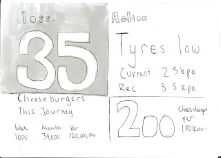
Final interactive design.
Cannot be uploaded because blogger is a dick and google pages no longer exists. Is on R drive
Sunday, September 11, 2011
Citroen be CRAZY
This is a pretty wild concept car from Citroen, and it has a whole load of screens, i like the way the HUD is one big long strip screen top to bottom, rather than just being a little piece of acrylic like Peugeot's and BMW's.
Concept HUD
Here is a flip book I made as my paper prototype. This is just a very rough estimation of the layout of my HUD.
Concept
My concept interface is a fuel saving device for a car which offers easy-to-read, up-to-date advice on ways to improve ones own fuel consumption in a heads up display. The device plugs into any modern car and pulls data from the car's computer, allowing it to notify the driver of the most effective change to maintain efficiency.
Because many people drive with large amounts of unnecessary weight in their trunk and under their seats, the device weighs each area of the car, and tells the driver the money that could be saved by removing it. The device will also monitor air-con, tyre pressure, windows, and driving habits. Many people do not realize exactly how much they are costing themselves and the environment, but when expressed in a more accessible form, they will see the value of their actions.
The fuel savings from each alteration can be expressed in money, food, carbon, and litres of fuel, over the drivers journey. The display will show how much of the given unit the driver is using by not following the fuel efficient instructions given by the device. This information will be real-time, but will also include cumulations of the unit over the course of the day, week, month and year based on calculations of the driver's habits.
This display/device aims to help people understand exactly what makes up their fuel usage, and what they can do about it, rather than just have a number that they are told is either good or bad.
Iron Man's HUD
Iron Man has one of the more exciting HUDs, hopefully i can find some inspiration from this. I feel the graphic is too action-y for a sustainability design, but the layout and shapes are interesting.
HUD
I have been looking at the idea of a heads up display in a car. This allows information to be sent to the driver without them having to look down or search for it. Information on a heads up display is also much more pervasive, it is hard to ignore, while not actually distracting the driver.
Saturday, September 10, 2011
BMW's HUD
BMW have made an upgrade to their HUD display, and can now project full colour and animations. This shows that the technology i propose to use is not far fetched at all. This technology will probably trickle down and be standard on base model cars in ten years, just as ABS and traction control have.
Subscribe to:
Comments (Atom)


