Thursday, October 13, 2011
Thursday, September 29, 2011
Final interactive design.
Cannot be uploaded because blogger is a dick and google pages no longer exists. Is on R drive
Sunday, September 11, 2011
Citroen be CRAZY
This is a pretty wild concept car from Citroen, and it has a whole load of screens, i like the way the HUD is one big long strip screen top to bottom, rather than just being a little piece of acrylic like Peugeot's and BMW's.
Concept HUD
Here is a flip book I made as my paper prototype. This is just a very rough estimation of the layout of my HUD.
Concept
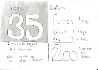
My concept interface is a fuel saving device for a car which offers easy-to-read, up-to-date advice on ways to improve ones own fuel consumption in a heads up display. The device plugs into any modern car and pulls data from the car's computer, allowing it to notify the driver of the most effective change to maintain efficiency.
Because many people drive with large amounts of unnecessary weight in their trunk and under their seats, the device weighs each area of the car, and tells the driver the money that could be saved by removing it. The device will also monitor air-con, tyre pressure, windows, and driving habits. Many people do not realize exactly how much they are costing themselves and the environment, but when expressed in a more accessible form, they will see the value of their actions.
The fuel savings from each alteration can be expressed in money, food, carbon, and litres of fuel, over the drivers journey. The display will show how much of the given unit the driver is using by not following the fuel efficient instructions given by the device. This information will be real-time, but will also include cumulations of the unit over the course of the day, week, month and year based on calculations of the driver's habits.
This display/device aims to help people understand exactly what makes up their fuel usage, and what they can do about it, rather than just have a number that they are told is either good or bad.
Iron Man's HUD
Iron Man has one of the more exciting HUDs, hopefully i can find some inspiration from this. I feel the graphic is too action-y for a sustainability design, but the layout and shapes are interesting.
HUD
I have been looking at the idea of a heads up display in a car. This allows information to be sent to the driver without them having to look down or search for it. Information on a heads up display is also much more pervasive, it is hard to ignore, while not actually distracting the driver.
Saturday, September 10, 2011
BMW's HUD
BMW have made an upgrade to their HUD display, and can now project full colour and animations. This shows that the technology i propose to use is not far fetched at all. This technology will probably trickle down and be standard on base model cars in ten years, just as ABS and traction control have.
Thursday, August 11, 2011
The Fidgeter
The Fidgeter is an interactive toy designed to punish the user for fiddling. By realizing that when fiddled with the toy hurts them, the user will then be caught in limbo between the lust to fiddle and the pain caused by the action. This is a play on the traditional etiquette of Britain, where it has been said that mothers would put spikes on the table to stop their children resting their elbows while eating.
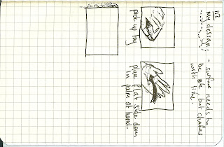
Instruction
- Pick up the Fidgeter
- Place it in between the thumb and first finger of your preffered hand.
- Turn the top button.
- Feel the burn.
Wednesday, August 10, 2011
Mechanism
The mechanism for the thumb drive is a very simple friction based drive. The power that one puts through the top piece of the drive is translated directly to the hand on the bottom side, via an axle made of galvanised steel.
this is the draft version:
The idea of the discs is pleasure vs pain, with two opposite circles of velcro providing the different feelings. The pleasure is for the fiddling thumb on top, and the pain is on the bottom for the index finger.
this is the draft version:
The idea of the discs is pleasure vs pain, with two opposite circles of velcro providing the different feelings. The pleasure is for the fiddling thumb on top, and the pain is on the bottom for the index finger.
A post about why clay isnt my friend.
Clay is not my friend for numerous reasons, mainly because it makes my hands look brown, and smell like the earth.
While i was working on this wonderous object, surely the most spectacular object to have come out of the DSDN 112 interactive design course in years, my old arch enemy clay struck!
This terracotta does not have the structural rigidity i require in my object, and cracked around the spinning disk. bollocks.
Thus, i am returning to my old friend wood, who has never failed me, except in being easy to work.
Here is a rough draft model made of wood:
My saviour.
refined clay shape!
i took my clay shape to my tutorial, and my together with my tutor, refined the shape down to this almost mouse-like gadget. the shape is symmetrical, so both left and right handed users will be able to punish themselves for fidgeting and interacting with this object. HOORAY!
Sunday, August 7, 2011
Clay models!
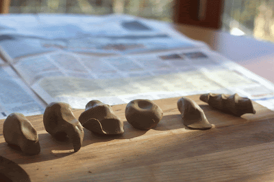
I have been exploring different shapes in clay. The beautiful thing about clay is the ease with which one can sketch a relatively complex shape, allowing ideas to flow from your mind in a second.

here are some of the ones i came up with. Because of the ease of my medium, i was trying to be as free as possible, and break away from the boxy handle grip design i previously had.
These are my two favourite designs, because they grip the hand of the user. They remind me somewhat of a roller style twink pen.
First draft model
This was my first attempt at the shape of the toy. i used a belt sander on a small block of wood to roughly approximate a grip.
The toy is two hand operated, one to hold and the other to turn the crank and cause pain. I have decided that this is too much involvement for a toy that is expressly for fidgeting. The toy will now be thumb driven. This first object also highlighted the need for a more rounded shape, it feels square and clunky in your hands. I decided to go to clay to explore shapes and the way one can interact with them.
Thursday, July 28, 2011
Tutorials week three
the two handed approach of the object doesnt allow for idle fiddling, a thumb driven thing would be way more effective. The thumb drive would have to be in a perfect place for easy rotation otherwise it would just be annoying.
Byron suggested that the drive was like a wind up toy, so one would turn the thumb drive until it snapped and sent something jabbing into ones hand, thus resetting it. this allows for great tension, both as the spring winds up, and as the user anticipates the pain.
Byron suggested that the drive was like a wind up toy, so one would turn the thumb drive until it snapped and sent something jabbing into ones hand, thus resetting it. this allows for great tension, both as the spring winds up, and as the user anticipates the pain.
Sunday, July 24, 2011
Proposal, Project 1
I wanted to make something that would satisfy peoples need to fiddle incessantly all the time, but i soon realised that there were infinite objects to fidget with, and my toy/machine would be entirely uneccesary. Instead, i opted to make something that would stop people from fidgeting all the time, even if it is a comforting way of occupying our hands. This machine would follow the principle of aversion training. Whenever someone tries to fiddle with it - and it should be so tempting to do so - they will find them selves rather in pain and somewhat dissatisfied with their experience. Another interesting feature of the device would be that of branding/marking the user as a fidgeter, in the hope that the subsequent public humiliation would make the user averse to fidgeting.
This whole project is a play on old fashioned rules of etiquette and the means used to enforce them (i have heard stories of spikes being put on tables to stop children eating with their elbows on the table).
I am planning on making the machine from wood, because its a material i really like working with and shaping. I have also entertained the idea of cutting several pieces of thin plywood and laminating them, to allow a really controlled shape. This would hopefully be quite attractive, seeing the plys run around the surface of the toy.
EXCITED!
Saturday, July 23, 2011
Aversion Therapy
http://en.wikipedia.org/wiki/Aversion_therapy
Aversion therapy is a form of psychological treatment in which the patient is exposed to a stimulus while simultaneously being subjected to some form of discomfort. This conditioning is intended to cause the patient to associate the stimulus with unpleasant sensations in order to stop the specific behavior.
This is the primary idea for my design, stopping people from fiddling, by causing them pain
Tutor advice
Proximity to the object one is fiddling with is important, as seen in the necklace interaction.
the size and shape of an object in ones hand is really key, because it will improve the ease of use. My toy needs to be more curved and freeformed, almost as if it is made of putty.
the size and shape of an object in ones hand is really key, because it will improve the ease of use. My toy needs to be more curved and freeformed, almost as if it is made of putty.
Bullshit grinders!
Otherwise known as a "Do Nothing Machine" or a "Trammel of Achimedes", these mechanical objects were my main inspiration for this project.
Friday, July 22, 2011
Fidgeting Toys
This toy uses human energy through fiddling and fidgeting to power electrical devices.
As does this one, although it is a yoyo at the same time.
This has to be the most iconic fiddling toy
Notebooksssss
here are some pics of my notebook, they sideways because its more ruthless, and fits with the ruthless idea i have for the project.
Subscribe to:
Posts (Atom)


